In the success of SCREAM, there was a lot of irony to go around. The slasher subgenre had virtually consumed the larger horror genre in the 1980s but it had gone into decline as that decade had progressed and by the end of the Reagan era, it was, in effect, dead and gone. By 1996, it had been dead and gone long enough that a fellow named Kevin Williamson could come along and write a loving homage to it, one that thoroughly deconstructed it and, by doing so, killed it for good and provided it a far better epitaph than it ever deserved. That was SCREAM. After the film suffered an embarrassingly poor opening weekend, word began to get around. It took off like a rocket and the film that should have ended the slashers brought them, instead, roaring back to life for a few more years.
"Life," there, shouldn't be read to suggest there was any real vitality in what followed. The slashers had, as a rule, been creatively bankrupt from birth and the trend set off by SCREAM was more about trying to ape the elements--and, hopefully, the success--of SCREAM. One of those elements, the one on which I'm going to narrowly focus here, was SCREAM's poster artwork. For a long time, I've had the idea of putting together a series of posts on the general degradation of the art of the movie one-sheet. In this era of Photoshopped "big faces" posters, even calling this an "art" anymore often stretches the meaning of the word to the breaking point. It's often--and correctly--noted that, in Hollywood, nothing succeeds like success, and any successful film is liable to see its poster artwork copied at some point. SCREAM, however, features what is probably the most copied artwork in the history of cinema. The knock-offs began appearing almost immediately, and have continued for over 16 years, as of this writing.[1] Their subjects quickly moved beyond the mere SCREAM-sploitation pictures; SCREAM knock-off posters were used for all manner of horrors, for sci-fi movies, action pictures, war dramas, even comedies.
What I've assembled here is just a little survey of this phenomenon. It is by no means, comprehensive--the subject is so enormous, I doubt anyone even could prepare one that covers it all. What's here is sufficient to make my point.
When SCREAM first appeared right at the end of 1996, this line of fresh, young faces decorated the artwork one found in the can at one's local movie house:

It was obvious that just about everything about SCREAM--except the fact that it was good--weighed heavily on the creators of this next picture (among them, SCREAM's own Kevin Williamson) when it turned up later that same year:

In 1997, SCREAM 2 also turned up. Copying itself, it would, itself, be often copied:

Some versions, such as this French one, removed the line of faces--I include it because it, too, is copied later:

This little sci-fi thriller also appeared, with a very appropriate title, insofar as its artwork is concerned:

The following year, 1998, someone took MIMIC up on its title:

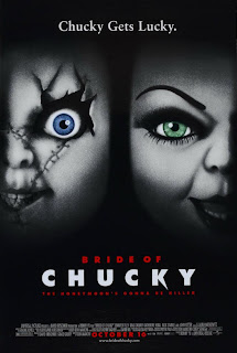
The ad guys trying to get out the word on THE BRIDE OF CHUCKY had seen the poster for SCREAM 2:
The poster for the 4th entry in the LETHAL WEAPON series SCREAMed:
"Life," there, shouldn't be read to suggest there was any real vitality in what followed. The slashers had, as a rule, been creatively bankrupt from birth and the trend set off by SCREAM was more about trying to ape the elements--and, hopefully, the success--of SCREAM. One of those elements, the one on which I'm going to narrowly focus here, was SCREAM's poster artwork. For a long time, I've had the idea of putting together a series of posts on the general degradation of the art of the movie one-sheet. In this era of Photoshopped "big faces" posters, even calling this an "art" anymore often stretches the meaning of the word to the breaking point. It's often--and correctly--noted that, in Hollywood, nothing succeeds like success, and any successful film is liable to see its poster artwork copied at some point. SCREAM, however, features what is probably the most copied artwork in the history of cinema. The knock-offs began appearing almost immediately, and have continued for over 16 years, as of this writing.[1] Their subjects quickly moved beyond the mere SCREAM-sploitation pictures; SCREAM knock-off posters were used for all manner of horrors, for sci-fi movies, action pictures, war dramas, even comedies.
What I've assembled here is just a little survey of this phenomenon. It is by no means, comprehensive--the subject is so enormous, I doubt anyone even could prepare one that covers it all. What's here is sufficient to make my point.
When SCREAM first appeared right at the end of 1996, this line of fresh, young faces decorated the artwork one found in the can at one's local movie house:

It was obvious that just about everything about SCREAM--except the fact that it was good--weighed heavily on the creators of this next picture (among them, SCREAM's own Kevin Williamson) when it turned up later that same year:

In 1997, SCREAM 2 also turned up. Copying itself, it would, itself, be often copied:

Some versions, such as this French one, removed the line of faces--I include it because it, too, is copied later:

This little sci-fi thriller also appeared, with a very appropriate title, insofar as its artwork is concerned:

The following year, 1998, someone took MIMIC up on its title:

The ad guys trying to get out the word on THE BRIDE OF CHUCKY had seen the poster for SCREAM 2:

The poster for the 4th entry in the LETHAL WEAPON series SCREAMed:

The I KNOW WHAT YOU DID LAST SUMMER gang was back with a sequel (which, despite the passage of time, was not called I KNOW WHAT YOU DID TWO SUMMERS AGO):

SAVING PRIVATE RYAN, Steven Spielberg's unfortunate Oscar-bait movie that year, was a Frankenstein's monster creation, sewn together from pieces of much better war movies from the past, so--in what this writer would like to believe was a private joke--those in the marketing department slapped a SCREAM on it:

More from the "Class of '98":


1999, the song remains the same:


The year 2000 sees the third installment of SCREAM, and again, the franchise copies itself:

And leads to further knock-offs:


In 2001, they come large and small:


David DeCoteau made a trilogy of films called THE BROTHERHOOD and was apparently so enamored of the SCREAM trend that variants on it advertised all three, the first 2 in 2001:

And the 3rd in 2002:


And on and on:
 |
| 2008 |
 |
| 2009 |
 |
| 2009 |
 |
| 2010 |
 |
| 2011 |
 |
| 2011 |
 |
| 2012 |
Monotonous enough to make you want to, well, scream, right?
--j.
---
[1] Not so long ago and in a different life, I owned a video store. One night, I was sufficiently bored that I rearranged an entire portion of the horror section to showcase only movies with SCREAM cover art. Before I was finished, I had the better part of three shelves covered by them.
--j.
---
[1] Not so long ago and in a different life, I owned a video store. One night, I was sufficiently bored that I rearranged an entire portion of the horror section to showcase only movies with SCREAM cover art. Before I was finished, I had the better part of three shelves covered by them.
I forget, how long did you have that video store? Was it a joy to operate one and gauge what people were into at the time?
ReplyDeleteAnd, to your question about wanting to scream, yes, I did after going through them. I remember all those dvd boxes when going through Movie Gallery shelves (the mom and pops were dead by then and this along with one short-lived store, that died thanks to the fucking economic collapse of 2008, called MovieTyme, were it) and lamenting the good ole days when I would peruse the VHS boxes.
So Scream was the first movie to show 3-5 cast members on the poster?
ReplyDeleteI worked at one store (Dynamite Video) for four years, then had my own (Movie Madness for three, with a gap in between--most of 8 years spent in the biz. It was great, and I often miss it (though I never miss the money headaches that came with owning my own). I miss video stores in general, though. These days, software manufacturers try to design apps to do what I used to do. I'm not replaceable by an app, though.
ReplyDeleteWorking a video store for a long time means many long, slow nights in the mix, and they allow you to spot--and be driven mad by--all sorts of trends like this. One trend in genre action pictures featuring established stars is to start, in their early films, with a full-body shot of that star (or near-full body shot), then, as the films progress, the camera gets closer and closer. By the most recent, you were seeing only part of the star's face on the cover, blown up to fill a huge space. This happened through the artwork on Schwarzenneger, Van Damme, Seagal, and probably others I'm forgetting (that may be a subject of a future post). I used to arrange these on the shelf in this order when I wasn't working for myself, but it was officially frowned upon, so it usually didn't stay up long.
When I put together that display of SCREAM rip-off covers (at my own place), I left it there for a few months. It got a lot of laughs and comments.
Nicely done, sir, nicely done :-)
ReplyDeleteHeaven forbid a cover for a movie contain pictures of the actors in it!!! Zomg!
ReplyDeleteYou didn't go back far enough. The Lost Boys 1987 movie poster was the first to showcase the major characters. It was the best also.
ReplyDeleteTHE LOST BOYS was a one-off; it set off no spate of copycat poster art, and has no connection to the later SCREAM fad.
ReplyDeleteThis post is dead on. I also noticed that after Scream was released, horror posters suddenly became extremely shitty and that copycat artwork (throw three to five good-looking people on the cover) became an epidemic. I have thousands of horror posters on my computer in folders and you can see the progressions and trends in ad art over the years. The ones from the old days are like beautiful little individual works of art, while the majority of newer ones (like the ones you have examples of) aren't very enticing. Newer ones that attempt to be old school typically de-color and add fake creases and such and they also look like crap IMO.
ReplyDelete