Me, writing almost exactly a year ago in the first of those intended posts. That first presentation was an exhibition on how corporate Hollywood's devotion to "nothing-succeeds-like-success" led it to seize upon the SCREAM poster artwork and duplicate it into infinity. It's been 18 years since SCREAM. People born back when it debuted are now graduating high school but the movie biz is still using that same damn poster to peddle its wares to the public. It's like some '80s-era joke about Soviet social regimentation, except the joke isn't on the commies this time.
Today's presentation bemoans the sad, declining state of movie-poster-ism from a different angle. These days, new features, even good ones, are routinely saddled with unbearably shitty artwork. Those Photoshopped faceful frescos then follow the flicks to home video, becoming, alas, the featured public face of the film for most who will see it. But what about older movies, the pictures produced from that bygone era when the one-sheet was considered an art and earned respect as such? Those of us with even a touch of grey in our chin-whiskers can legitimately grouse about our living memories of the not-so-long-ago back-in-the-day when a lot of movies, upon their initial releases, sported poster artwork that was outright awesome, things you actually wanted to take home and hang on your wall. Those movies come to home video too, in wave upon wave, but often--far too often--that classic artwork ends up being discarded and replaced by, comparably, substandard rubbish that looks an awful lot like the awful, substandard rubbish that passes for artwork on the newer flicks with bad artwork.
When I was but a lad, I had STAR WARS on my wall:
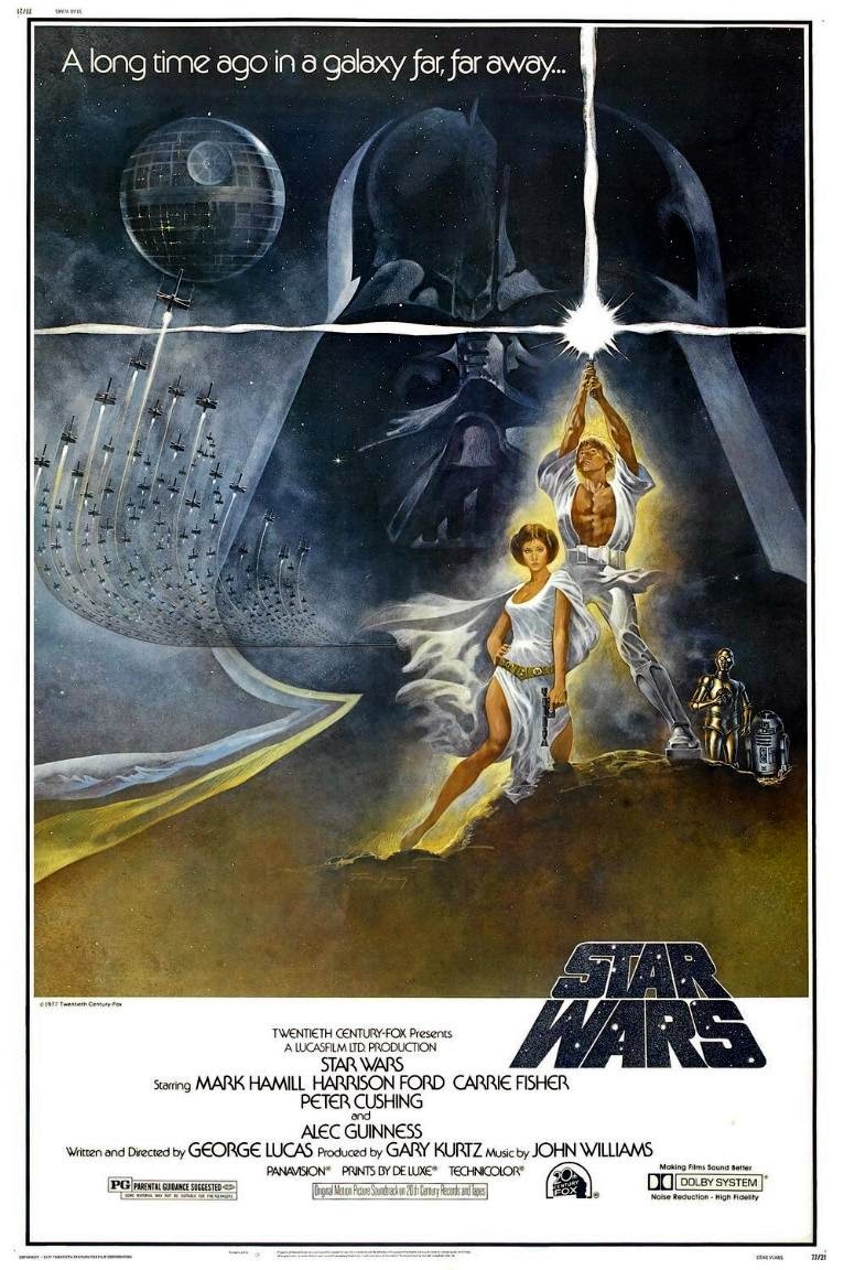
And not on my wall, but accompanying the film's release...


Can't argue with that, right? Well, it seems you can if you're George Lucas. When STAR WARS came to DVD, it wasn't with these images as covers. Instead, it was...


Feeling the overwhelming sense of being underwhelmed yet? I'm just getting started.
THE DIRTY DOZEN is a kickass picture with a kickass premise and kickass cast, and when, in 1967, it first kicked ass on the big screen, here's how its kicking ass was pimped to potential viewers:

When it made its way to DVD, though, there were definitely no boots to heinie:

In 1975, Roger Corman's shop turned out DEATHRACE 2000, which became their most successful feature up to that time. The poster that helped sell it:

Now take a gander at the cover Buena Vista (Disney) slapped on it when they were distributing it on DVD:

Thankfully, the most excellent Shout! Factory later corrected this, returning to the original artwork for their re-release edition.
Another hit pic of the period featuring fast cars and a race across the country was SMOKEY & THE BANDIT (1977). Its poster:

And look at what ended up on the DVD:

Still another road picture and an action classic, THE ROAD WARRIOR (1981):

And its significantly-less-than-classic home video incarnation:

Still out on the violent, crazy road, Clint Eastwood's 1977 actioneer THE GAUNTLET was blessed with poster artwork by the great Frank Frazetta:

And here's the DVD release:

(Thankfully, the Blu-ray release has apparently restored the original artwork.)
Clint's second Man With No Name flick FOR A FEW DOLLARS MORE (1965) offers another look at this phenomenon. The original poster:

Worth at least a thousand words. And the original DVD release:

A picture worth about 999 words less. MGM was responsible for that particular turd of a cover, and the company is one of the worst in the business for this sort of thing. Here, for example, is the poster for the 1975 James Bond outing THE MAN WITH THE GOLDEN GUN:

And what MGM did:

Still another: 1983's OCTOPUSSY:

And MGM's home video release:

All of the Bonds (and a lot of MGM's back catalog) are treated this way.
John Boorman's excellent EXCALIBUR (1981) had poster artwork worthy of the film:

On DVD, though, this is what was slapped on it:

The 1976 remake of KING KONG:

The promise of "the most... original motion picture event of all time" to advertise a remake is most amusing. Less amusing is what happened to this Kong's artwork on his second DVD release:

Another monster brought to the screen, this time by Wes Craven, was DC Comics' SWAMP THING (1982). Its poster appeared as an ad in DC's entire line of comics on the film's release:

When it came to DVD, though, the cover itself was the monster (and not in any good ways):

Freddy Krueger became a box-office sensation in the '80s. This is the killer poster that greeted crowds of the curious in 1984:
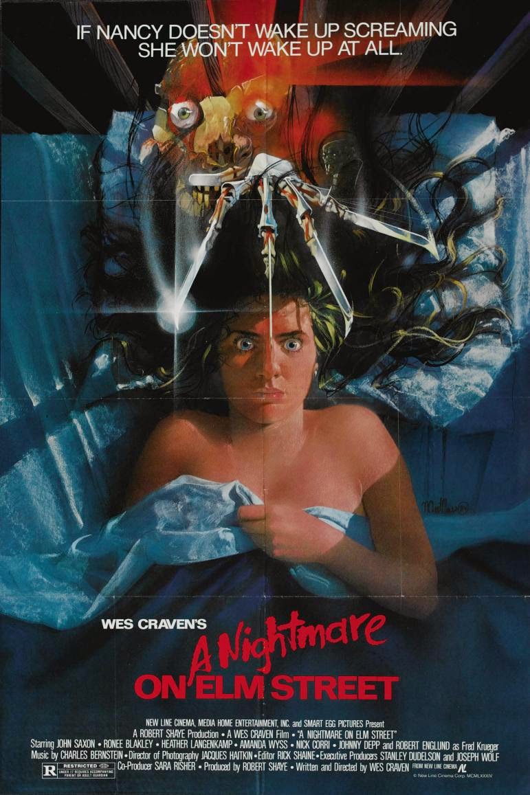
By the time it hit DVD, though, the artwork had become nightmarish in an entirely different way:

The original nightmare continued with A NIGHTMARE ON ELM STREET 3: DREAM WARRIORS (special thanks to "GaiaClaire" on the IMDb's horror board for noting this one):

...and the artwork nightmare continued with its later DVD release, too:

THE LAST ACTION HERO (1993) was an expensive bomb for Arnold Schwarzenegger, but it's actually a fun and unfairly dismissed movie. Its poster:

On home video, its distributors gave it a cover that treated it about as fairly as its harshest critics had:

Looking over such atrocities (and the others in this vein are absolutely legion), one gets the impression that there are lots of lost bets involved or that perhaps lurking behind such decisions are sinister hidden agendas aimed at sabotaging the pictures. One can conjure up images of resentful men in marketing departments who realize their contemporary work is rubbish and attempt to sabotage the releases of old films in their care so as not to have those films' superior poster artwork on the shelves next to their own deficient efforts. Who knows? The only thing one can say for sure is... well, you don't need me to tell you that.
--j.
Excellent analysis. My friend and I were just talking about the same thing! Shame they just sidestep the beautiful art for the lame paste-together Photoshop junk. And you're right, MGM is notorious for this.
ReplyDelete